Visual editor
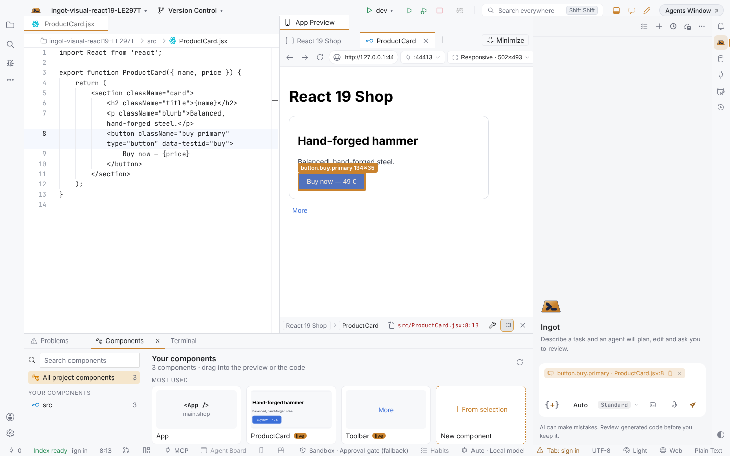
Click an element in your running app and land in the code that draws it. The Visual editor is its own mode: your app large in the middle, the code beside it, the agent chat on the right and your components at the bottom. Minimize it and the IDE is back exactly as you left it.
Bronze The mode, hover, click into the source and the element path come with Bronze and up. Silver The element in the chat, editing props and styles, and the component library come with Silver, Gold and Platinum. On another plan, the button stays and shows which plan has it.
Open the Visual editor
Open your app in the App Preview (a running dev server, a port or any URL), then click Visual edit in its toolbar, the Visual Editor pencil in the title bar, or press ⌥⇧V (Alt+Shift+V) while the preview has focus. App Preview: Toggle Visual Edit in Find Action does the same.
The mode lays out:
- the live preview large in the middle, with a tab per page (and per pinned component) and its toolbar on one line: address, port, Responsive device menu, width × height, zoom, Visual edit, Pick element, the component library and Run (starts your
dev,startorservescript in a terminal); - the code beside it: your open files as tabs, and the selected element's file at its line;
- the agent chat on the right;
- the component library as a strip at the bottom.
Minimize in the preview's tab strip, Esc, ⌥⇧V or the same button closes the mode and puts the IDE back exactly as it was: your tabs, the side bar and the bottom panel. Open it again and it continues where you were.
Hover, click, land in the code
- Hover outlines the element under the pointer. Its tag names the component first, then the element and its size:
PayButton · button.pay.primary 73×35. - Click selects the element. Its outline stays, and its file opens beside the preview with the caret on the element's line and column. Keep clicking: each click selects the next element.
- Links and buttons are selected, not followed or pressed.
Tell the agent in the chat
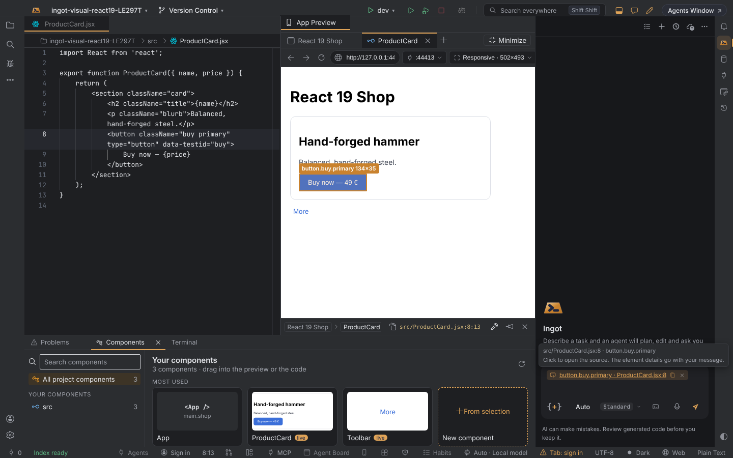
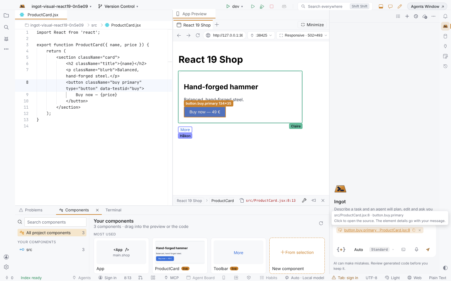
The selected element goes into the agent chat as a chip, button.buy · ProductCard.jsx:8. Type what you want next to it ("match the design: say Pay 72.00 €") and send: the agent gets the element path, props, source file and line, selector, styles and HTML with your words. A new click replaces the chip, so the chat always holds the element you are looking at. Hover the chip for its file, line and element; the copy icon on it copies the full element details.
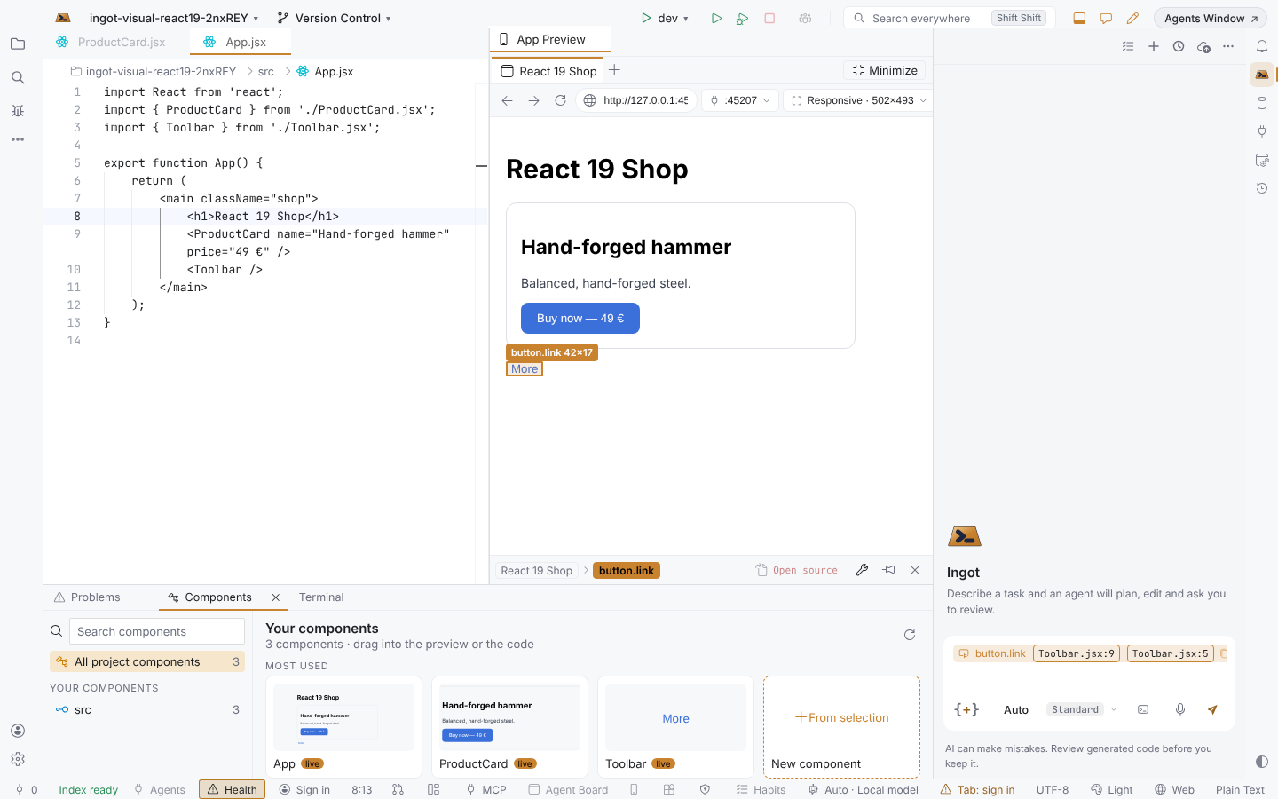
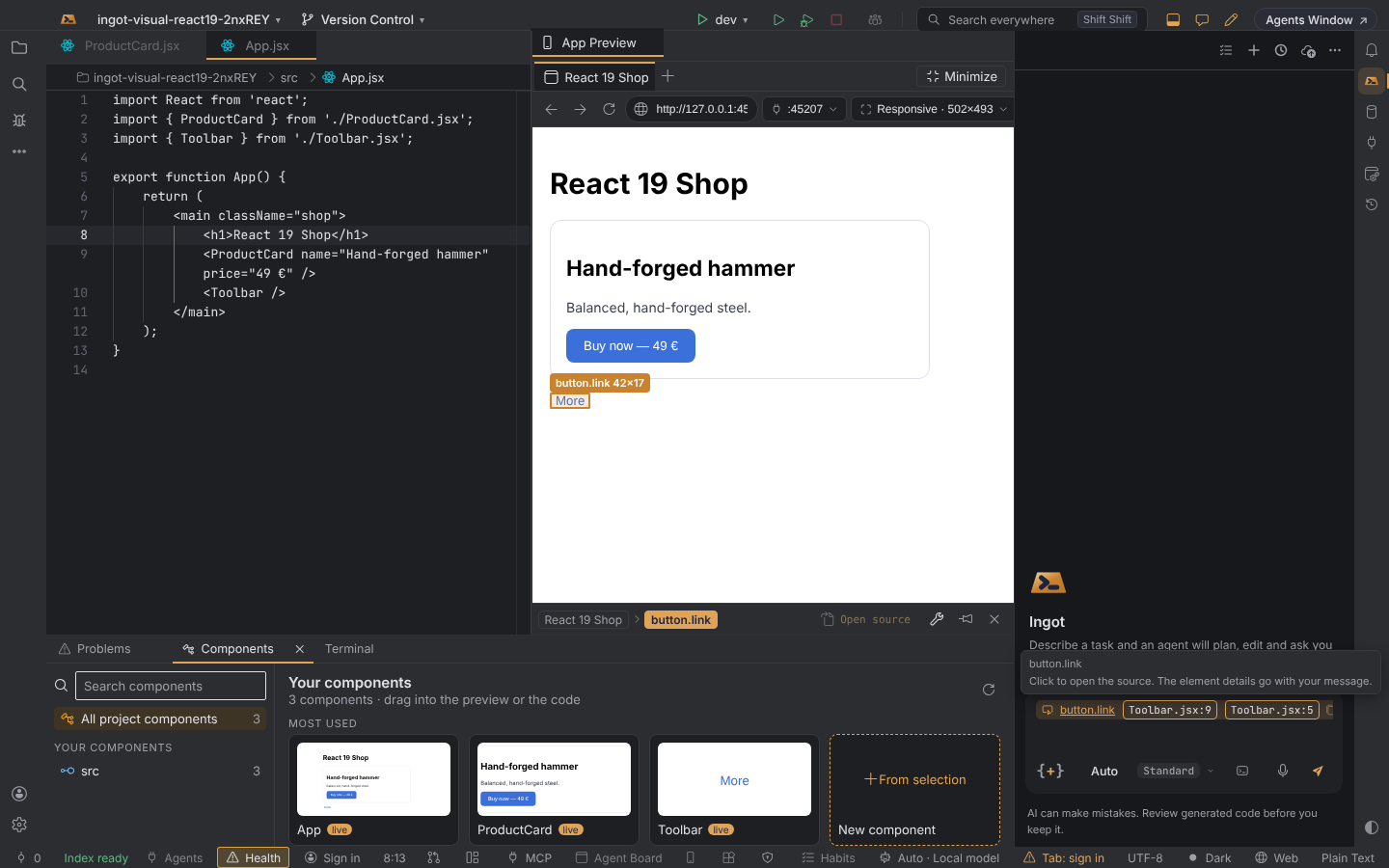
When two places in your code match the element equally well (the same button written twice), the chip shows both, Toolbar.jsx:9 Toolbar.jsx:5. Click one: it opens, and it is the one your edits and the agent use.
The element path bar
Under the preview, the path bar shows Page › … › Component › element with the selected element highlighted, and on the right: Open source with the file and line, the props icon, a pin that adds the component as a preview tab, and × to clear the selection.
Edit props and styles
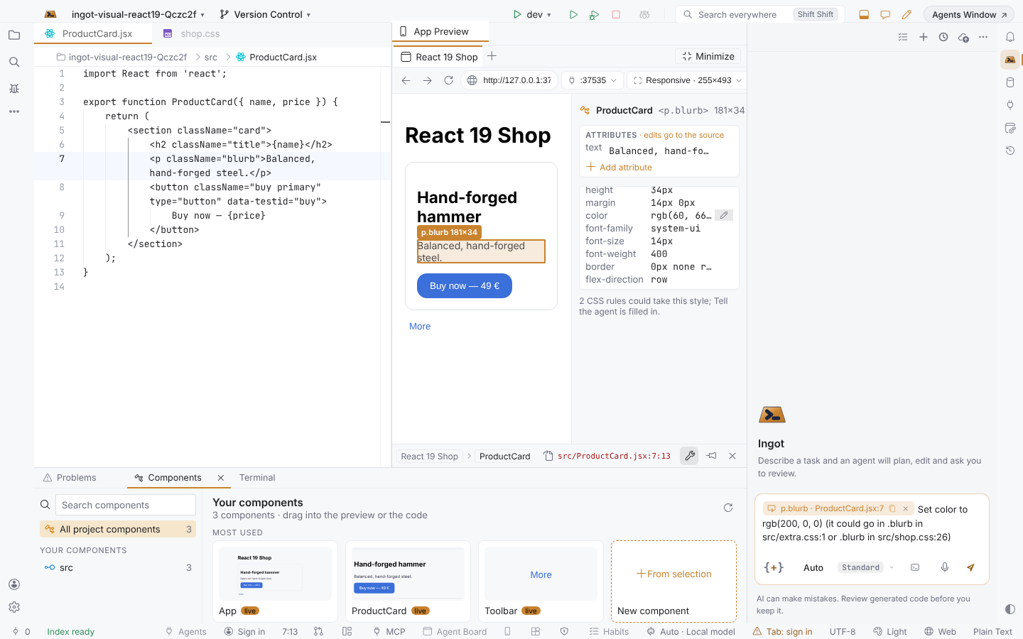
The props icon on the path bar opens a panel beside the page (the page narrows, so every element stays clickable; Esc or × closes it) with the element's props or attributes and its styles. Hover a value and click ✎ (or double-click it), type, and press Enter:
| What | Written to |
|---|---|
| text | The plain text between the tags in the JSX: <h3>Order total</h3> becomes <h3>Your total</h3> |
| A prop or attribute | Its string value in the JSX, keeping its quotes: label="Apply", title='…', size={"lg"}; class is written as className |
| Add attribute | name=value adds a new attribute to an HTML tag |
| A style | The CSS rule of the element's class (.buy { border-radius: 14px; }) or its CSS-module rule (styles.pay); with no rule, an inline style={{ … }} on the element |
Each change is one undoable edit in the file's editor, saved, and the page shows it at once while your dev server reloads. A note says where it went.
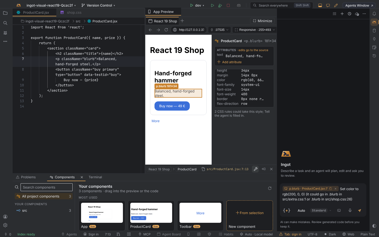
Ingot never guesses: an expression (value={total}), nested markup, a prop a component does not write in its JSX, or a style that two CSS rules could take is left as it is. The note says why, and the request goes into the chat box (Set color to … (it could go in .blurb in src/shop.css:26 or .blurb in src/extra.css:1)), so one Enter hands it to the agent.
Component library
The strip at the bottom shows your components (by folder) and your UI packages (the components their API exports, read from node_modules). Search, pick a folder or a package, and:
- Live cards show a component as your page draws it right now; components that are not on the page show their name and outer element.
- Drag a card into the code to write
<Name />where you drop it, or onto the preview to write it after the element under the pointer. The import is added when the file does not have it: a relative path for your components, the package name for packages. - + From selection asks the agent, in the chat box, to make a new component from the selected element.
- Open package opens its
package.json; Update to x.y.z shows when a newer version is out and runs the install in a terminal. Double-click a card to open the component.
Working together
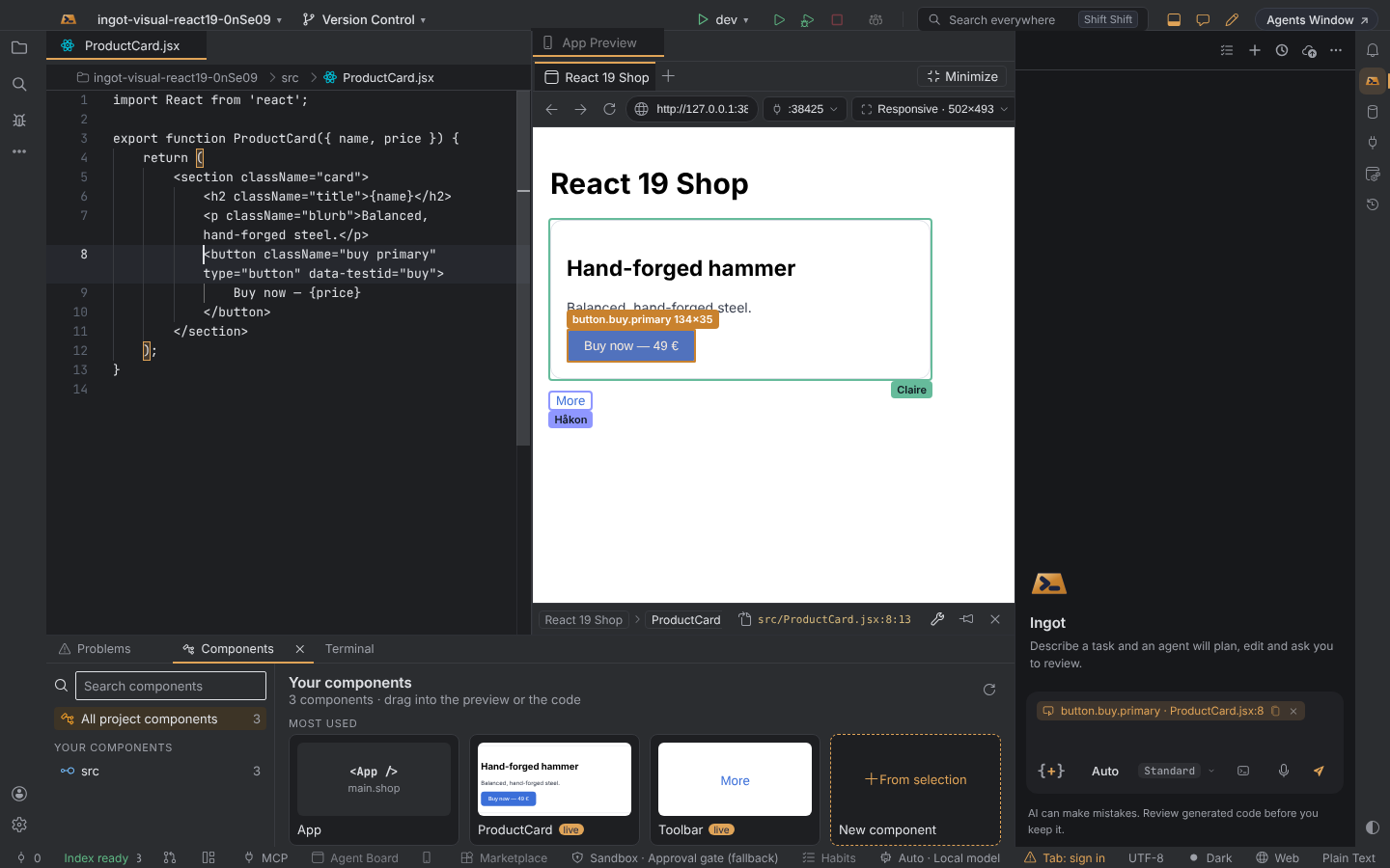
In an Ingot Together session, the elements your teammates selected on the same page show with an outline in their colour and their name, and their initials show in the preview's tab strip.
How Ingot finds the source
Nothing is added to your project: no plugin, no package, no config file, and it does not matter how you start your dev server. Ingot keeps its own index of the project's JSX, TSX, HTML, Vue and Svelte (in memory, never written to the project) and matches each click against it:
- The index. Every element written in your code, with its file, line and column, its tag or component, the component whose code writes it, its static class names, its text, and attributes that identify it (
id,data-testid,aria-label,href,type,placeholder, and more). Saving a file updates the index at once. - The click. The preview sends what the page knows about the element: tag, classes, text, those attributes, the elements around it, and the component names the framework gives at runtime, if any.
- The best match opens. Ingot scores the places that could have drawn the element and opens the best one at its exact line. CSS-module class names match their key (
styles.payis_pay_x1y2in the page), and a component usage is found by the text it passes (<PayButton label="Apply" />for a button that reads Apply).
An element drawn inside a library component resolves to your code that uses it (the <Button> in your page, not the library's file).
What a dev build says about itself (data-ingot-source, React 18 dev data, Vue and Svelte dev data) is used as an extra signal only. It is never needed: React 19, plain JSX and every bundler work the same way.
Settings
| Setting | Where | Default |
|---|---|---|
ingot.appPreview.visualEditor | Settings › Features › Visual editor | On |
ingot.appPreview.visualEditor.sourceIndex | Settings › Features › Find the source in Ingot's index | On |
ingot.appPreview.visualEditor.componentLibrary | Settings › Features › Component library | On |
ingot.appPreview.visualEditor.openSourceOnSelect | Settings › Tools › Visual editor | On |
ingot.appPreview.visualEditor.styleEdits | Settings › Tools › Visual editor › Write style edits to CSS | On |
With open source on select off, a click only selects; open the file with Open source on the path bar. With style edits to CSS off, styles are written as inline styles.
Good to know
- Pick element in the App Preview (outside the mode) still picks one element for the agent and then stops.
- The Visual editor mode never changes your saved layout: minimize always returns to the layout you had.