Theme tokens and custom colors
Every Ingot panel takes its colors from your color theme, and the accent color is yours to choose, for all projects or for one project.
Panels, cards, dialogs, menus and the Commit window read their background, text, border, list and input colors from the active color theme. Nothing is drawn in a fixed light or dark color, so a dark theme never shows a white panel and a light theme never shows a dark one. This holds for every Ingot theme (Light, Dark, Ember, Paper, Graphite, Slate, Midnight and the two High Contrast themes) and any color theme you install from Open VSX.
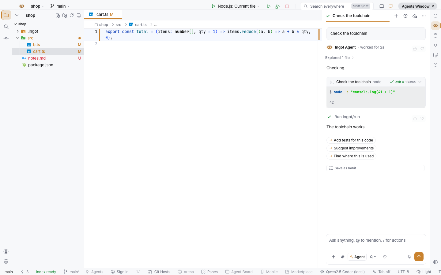
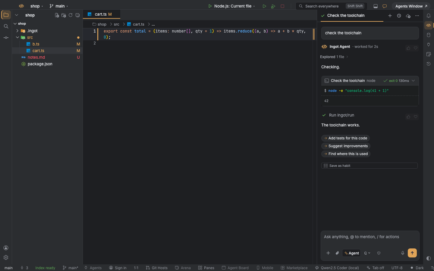
Two kinds of color
| Kind | Where it comes from | What it colors |
|---|---|---|
| Theme colors | the active color theme | backgrounds, text, borders, lists, inputs, menus, diff and status colors |
| Accent colors | the ingot.colors.* settings (Ingot amber by default) | primary buttons, links, focus rings, badges, the active tab and the Ingot mark |
Change the color theme and the theme colors follow at once, without a reload. The accent colors stay the ones you set, in the light or dark variant that fits the theme.
Theme tokens
Ingot's own UI uses a small set of named colors, the theme tokens. Each one points at a color of the active theme; when a theme leaves a color out, the token falls back to another color of the same theme, never to a fixed one.
| Ingot token | Theme color |
|---|---|
Window and side panels (--ingot-bg) | sideBar.background, else editor.background |
Cards, dialogs and floating windows (--ingot-surface) | editorWidget.background |
Toolbars (--ingot-toolbar) | titleBar.activeBackground |
Text (--ingot-text) and secondary text (--ingot-text-muted) | foreground, descriptionForeground |
Borders (--ingot-border) | contrastBorder, else widget.border, else panel.border |
Row under the pointer (--ingot-hover) | list.hoverBackground |
Selected row (--ingot-selected) | list.activeSelectionBackground and list.activeSelectionForeground |
| Inputs | input.background, input.foreground, input.border |
| Success, warning and error | charts.green, editorWarning.foreground, errorForeground |
| Added and removed lines | diffEditor.insertedLineBackground, diffEditor.removedLineBackground |
| Git file status | gitDecoration.* colors |
| File icons, badges and labels | the terminal's ANSI colors (terminal.ansiBlue and the others) |
| Shadows | widget.shadow |
A theme that changes one of these colors changes it everywhere in Ingot. For example, a theme with a blue editorWidget.background gives Settings, the Commit window and the chat tool cards the same blue.
Custom colors
The accent color is a setting, not part of the code. The default is Ingot amber: #C9822E in light themes and #E0A458 in dark ones. To use another accent everywhere, add it to ~/.ingot/settings.json (or ~/.ingot/ingot.settings.json):
{
  "ingot.colors.light.accent": "#2F6FEB",
  "ingot.colors.dark.accent": "#6EA8FE"
}
To give one project its own accent, put the same keys in ingot.settings.json at the project root. The project file wins over the global settings, so each repository can have its own color:
// ingot.settings.json (project root)
{
  "ingot.colors.light.accent": "#E67E22",
  "ingot.colors.dark.accent": "#F39C12"
}
Changes apply as soon as you save the file. Hover, focus, selection, the text on accent buttons and the Ingot mark colors have their own keys; every key, its default and what it does is in the Settings reference.
Panels that follow the theme
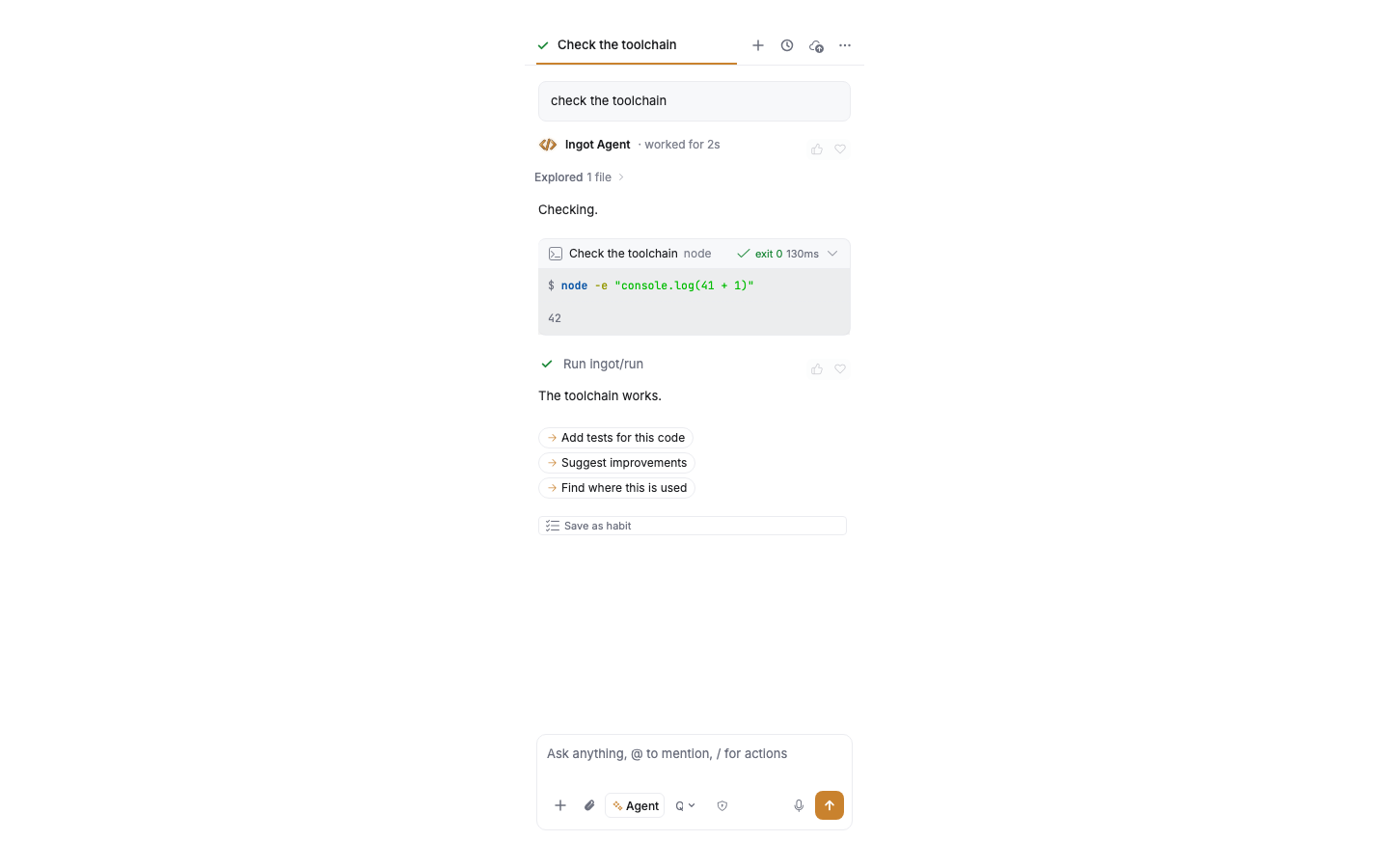
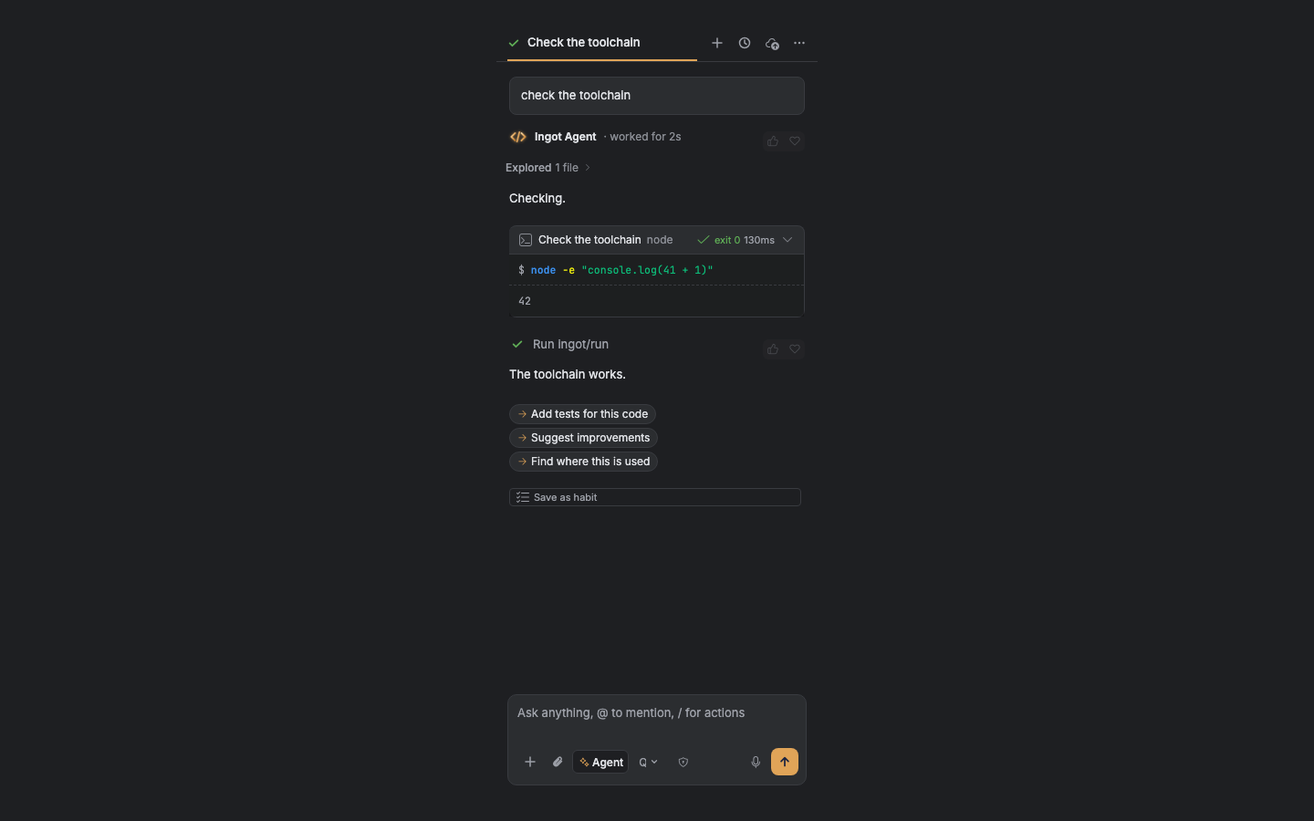
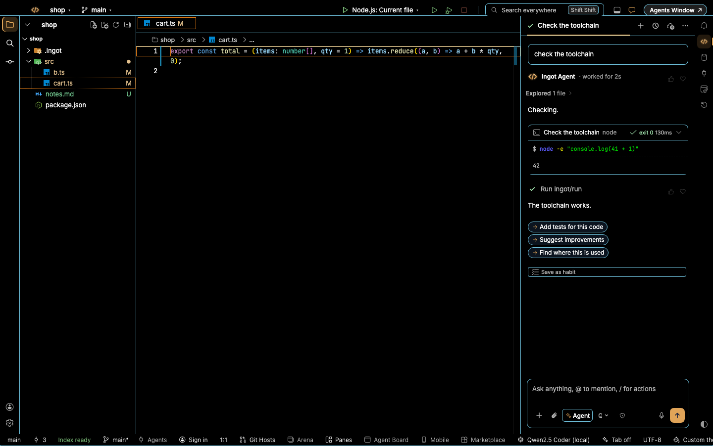
The agent chat and its tool cards sit on the editor and side bar colors, with the terminal's colors for shell commands. See Chat colors & themes for every part of the chat.
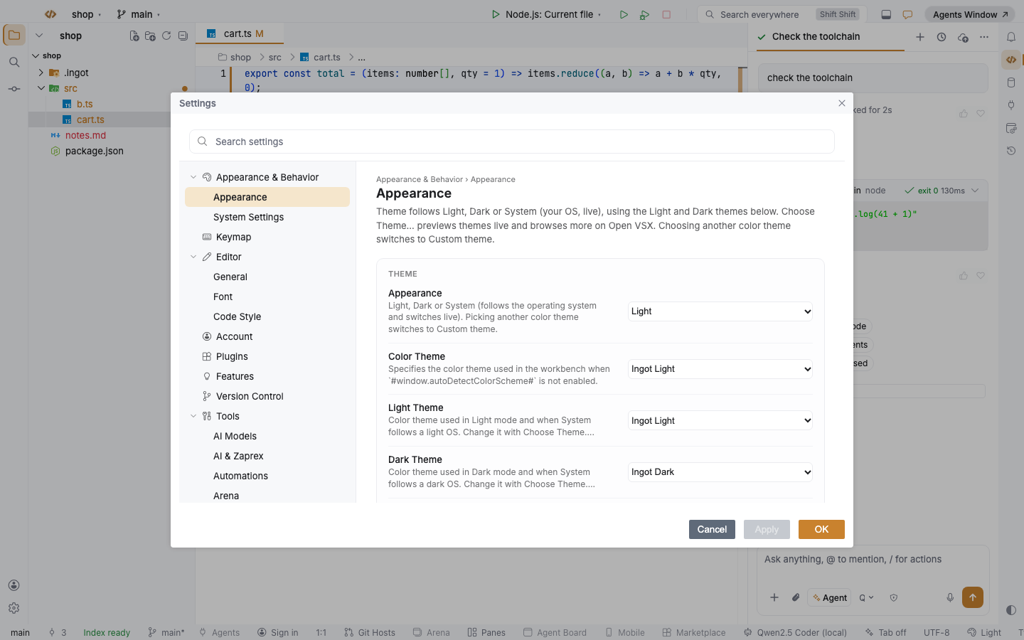
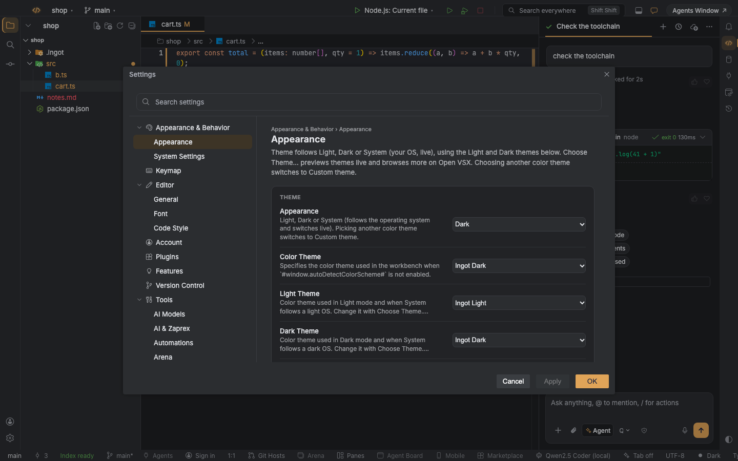
Settings is a dialog in the widget colors: the search box is an input, and the selected page uses the list selection.
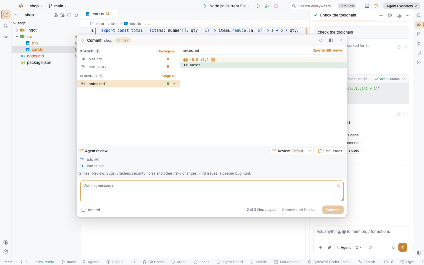
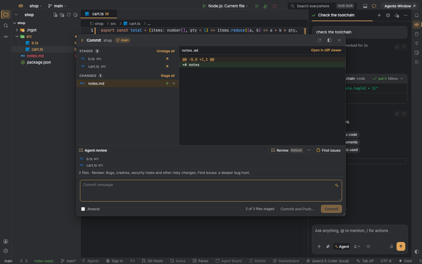
The Commit window floats over the editor in the widget colors, with the theme's Git status colors for each file.
High Contrast
High Contrast themes draw borders instead of fills. Ingot's panels pick up the theme's contrast border, its black background and its focus border, with no white panel anywhere.
Questions
Why did some panels change color after an update? Earlier versions drew a few panels, such as Settings pages, the Commit window and file badges, in fixed Ingot colors. They now use your theme's colors, so they match the editor around them.
Can I change only the accent and keep the theme? Yes. The ingot.colors.* settings change the accent only; backgrounds, text and borders still come from the theme.
Can I set a different accent per project? Yes. Put ingot.colors.* keys in ingot.settings.json at the project root. Projects without that file use your global accent.
Which themes are supported? All of them: the nine Ingot themes and any color theme from Open VSX or a theme .json. Choose one in Settings › Appearance › Choose Theme…, see Color themes.