Chat colors & themes
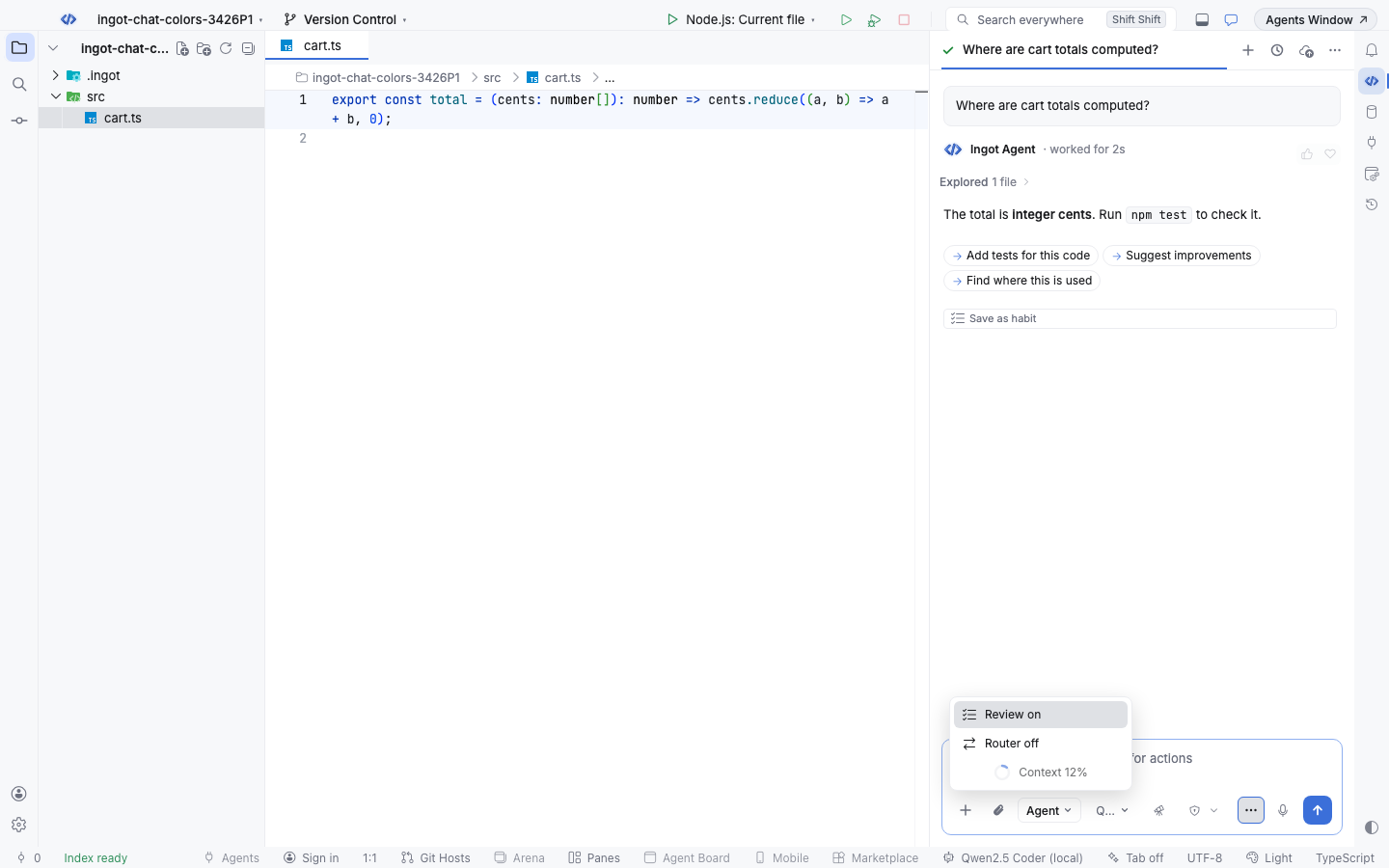
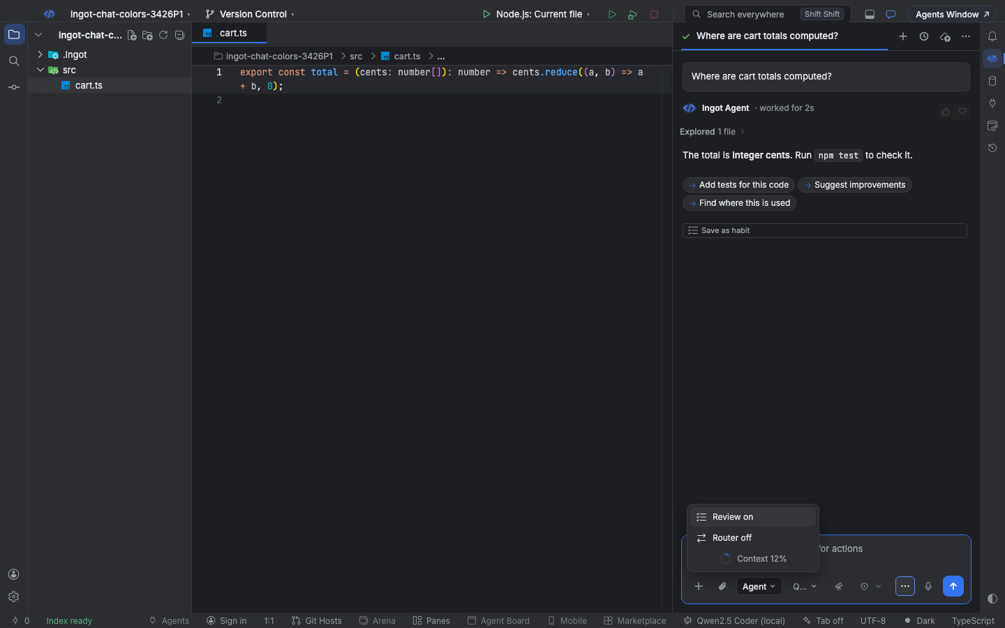
The agent chat panel and its controls take their colors from your color theme, so the chat always matches the editor next to it.
That holds for Ingot Light, Ingot Dark, Ingot Ember, High Contrast and any color theme you install from Open VSX. The chat box, buttons, menus and their hover, selected and focus states change with the theme, at once and without a reload.
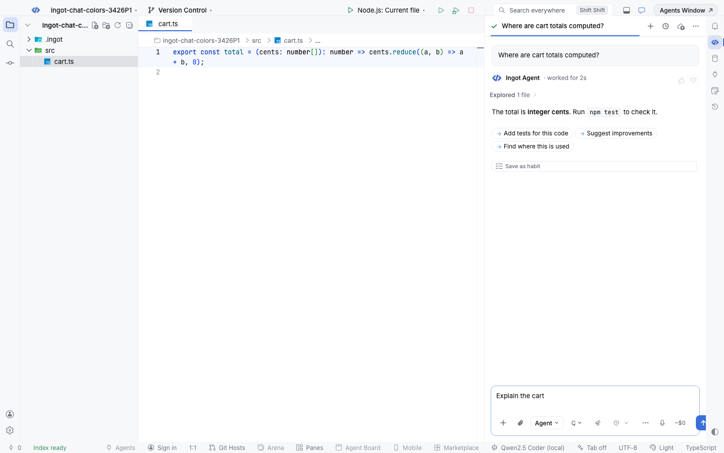
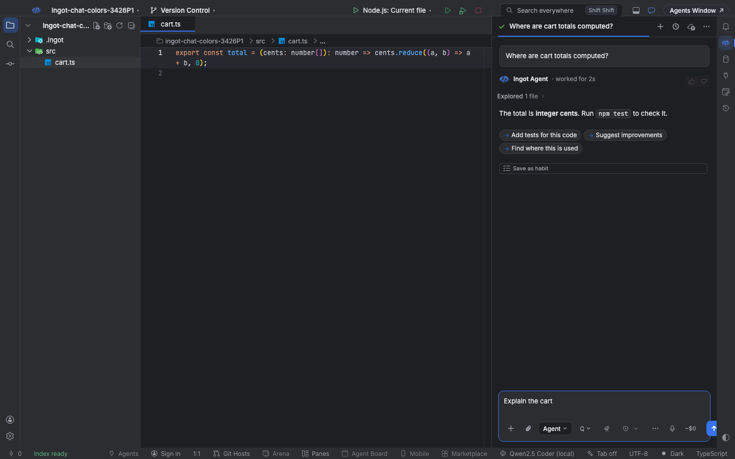
What follows the theme
Every part of the chat reads a color from the active theme. Themes that leave a color out get a sensible fallback from the same theme, never a fixed light or dark color.
| Part of the chat | Theme color |
|---|---|
| Panel background | editor.background |
| Prompt cards, tool cards and the top bar | sideBar.background |
| Chat box | input.background, input.foreground, input.border, input.placeholderForeground |
| Send, Accept all and other primary buttons | button.background, button.foreground, button.hoverBackground |
/ commands, the overflow menu and pickers | menu.background and menu.foreground (editorWidget.background when the theme has no menu colors) |
| Row under the pointer | list.hoverBackground |
| Selected row | list.activeSelectionBackground and list.activeSelectionForeground; High Contrast outlines it with contrastActiveBorder |
| Keyboard focus | focusBorder |
| Links | textLink.foreground |
| Errors, warnings and notes | errorForeground, editorWarning.foreground, editorInfo.foreground |
| Agent modes, file badges and the context bar | charts.blue, charts.purple, charts.green, charts.yellow, charts.orange, charts.red |
| Shell commands in tool cards | the terminal's ANSI colors |
| Added and removed lines | diffEditor.insertedLineBackground, diffEditor.removedLineBackground |
Menus, hover and selection
Type / in the chat box: the command list is a menu in the theme's menu colors. The row under the pointer uses the list hover color and the selected row (the one Enter picks) the list selection, so you can always tell them apart.
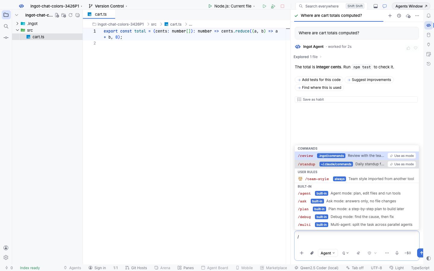
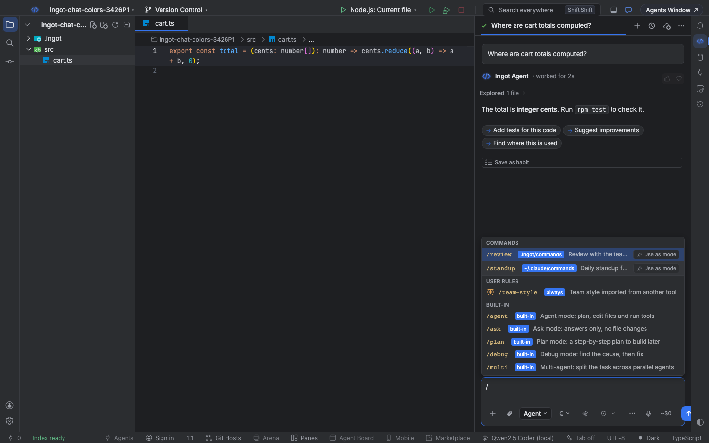
The More menu (the three dots in the chat box) and the model and mode pickers work the same way.
Change the theme
Choose Theme: Light, Dark or System from Find Action, the theme button on the stripe, or Settings › Appearance › Theme. Pick custom to use Ingot Ember, High Contrast or any installed color theme. The chat follows the change straight away, see Layout and Extensions & themes.
High Contrast
High Contrast themes draw borders instead of fills. In the chat, cards, menus and the chat box get the theme's contrast border, the selected row an outline in contrastActiveBorder, and keyboard focus the theme's focus border.
Questions
The chat looks different after an update. Why? Earlier versions drew the chat in fixed Ingot colors. It now uses your theme's colors, so it matches the editor, the side bar and the menus around it.
Can a theme change only the chat? No. The chat uses the same theme colors as the rest of Ingot: a theme that changes button.background changes Send and every other primary button.