Color themes
Ingot ships nine color themes of its own, and it can install any color theme from Open VSX or a theme .json file. Pick one in Settings › Appearance › Choose Theme…. Ingot Light and Ingot Dark stay the defaults.
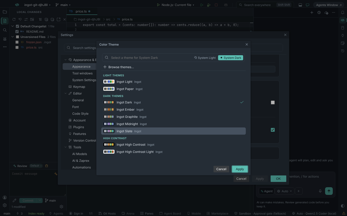
The Ingot themes
| Theme | Kind | Look |
|---|---|---|
| Ingot Light | light | the default light theme, with the Ingot amber accent |
| Ingot Dark | dark | the default dark theme, with the Ingot amber accent |
| Ingot Ember | dark | the Ember dark theme, with the Ingot amber accent |
| Ingot Paper | light | warm paper with a deep ink-blue accent |
| Ingot Graphite | dark | neutral, calm greys with a quiet blue-grey accent |
| Ingot Slate | dark | cool blue-grey with a teal accent |
| Ingot Midnight | dark | deep navy with a soft periwinkle accent; amber only shows as the selection wash |
| Ingot High Contrast | high contrast | dark, see High contrast |
| Ingot High Contrast Light | high contrast | light, see High contrast |
Each of the newer themes (Paper, Graphite, Slate, Midnight and the two High Contrast themes) brings its own accent for buttons, focus rings and badges. That only holds while the ingot.colors.* accent settings are at their defaults: once you set an accent yourself, your colour wins in every theme. See Theme tokens and custom colors.
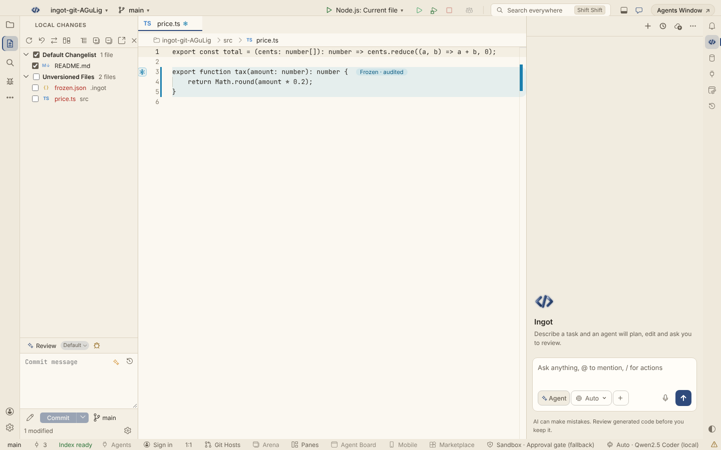
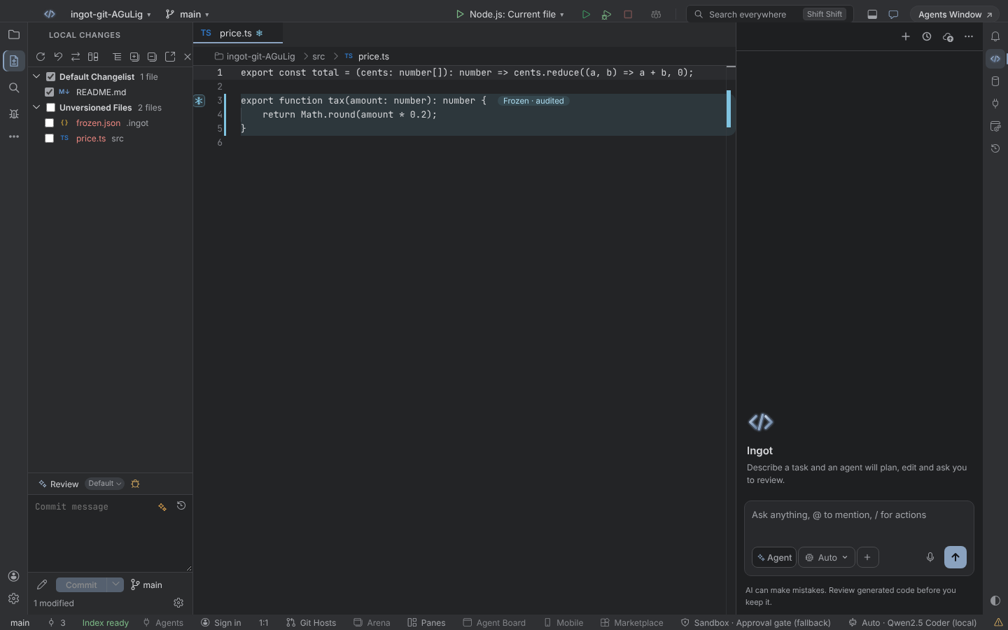
The picker
Settings › Appearance › Choose Theme… opens the Color Theme picker.
- Every theme has a colour swatch, so you can see it before you apply it.
- Themes are grouped as Light themes, Dark themes and High contrast.
- System Light and System Dark at the top pick the theme used for each side when Appearance follows your operating system (see Layout).
- Browse themes… installs a color theme from Open VSX (see Imported themes).
The platform's stock themes (the Dark, Light and High Contrast themes that come with the underlying workbench) are no longer listed. They stay installed only so that an old setting that points at one of them still works.
High contrast
Ingot High Contrast and Ingot High Contrast Light are for when you need the strongest contrast:
- body text and syntax colours have a contrast of 7:1 or more against the background
- every widget has a visible border
- the focus outline is distinct, so you can always see where the keyboard is
- a disabled Commit button keeps a readable label instead of a faded fill
Imported themes
You can use color themes made for other editors that publish to Open VSX:
- Browse themes… in the picker installs a theme from Open VSX (a
.vsix). - Import Color Theme… in Settings reads a theme
.jsonfile.
Installed themes are kept in ~/.ingot/themes.json. They survive reloads and are shared by every project.
Ingot's own panels take their colours from the imported theme: the title bar, the Commit panel, Local Changes, the chat and the status bar use the theme's backgrounds, borders and text, instead of Ingot's greys. Buttons and badges keep the Ingot accent (or the one you set).
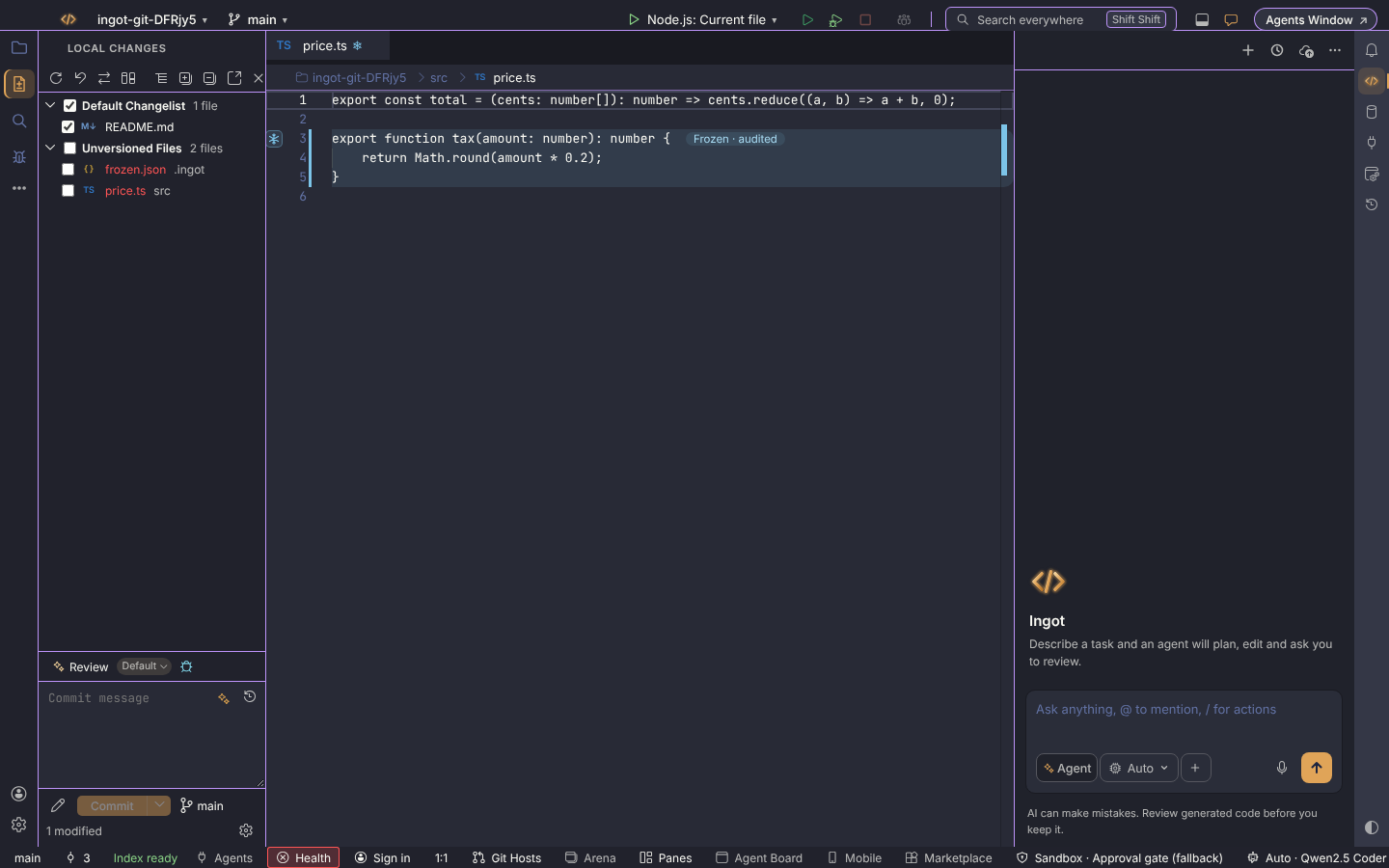
Themes work the same in the desktop app and the browser.
Questions
My accent did not change when I picked Ingot Slate. You have an ingot.colors.* accent set. Remove it from your settings to get the theme's own accent.
An old theme is missing from the picker. The platform's stock themes are hidden. Ingot Light, Ingot Dark and Ingot High Contrast cover the same ground. If your settings still point at an old one, it keeps working.
Where do I change only one colour? See Theme tokens and custom colors, and Chat colors & themes for the chat.